

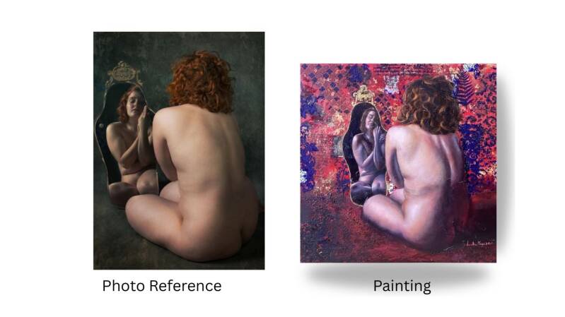
Choosing the right reference image is the silent foundation of a great painting. Before the first brushstroke even touches the canvas, the quality, complexity, and lighting of your source material have already determined about 70% of the final outcome.
Whether you are snapping a photo of a sunset or scrolling through a digital gallery, here is how to select a reference that sets you up for success.
1. The Skill-Reference Match: Walking Before You Run
One of the most common pitfalls for beginning artists is choosing a "marathon" image when they are still mastering the "baby steps."
• Assess the Complexity: If you are new to portraits, starting with a face in direct sunlight with complex lace clothing might be overwhelming.
• The "70/30" Rule: Choose a reference where 70% of the elements are within your comfort zone and 30% challenge you. This ensures you grow as an artist without reaching a level of frustration.
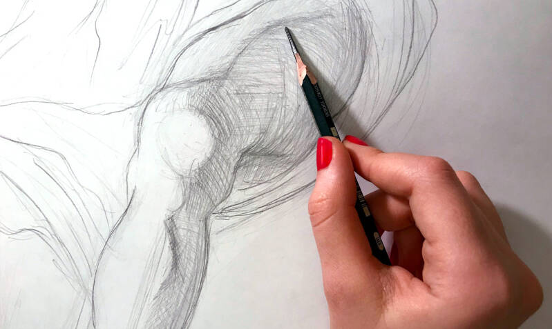
• Focus on Shapes: Look for images with clear, simple shapes. If you can’t squint and see the basic structure, it might be too detailed for your current stage.
2. The Power of "Dynamic Range" and Lighting
Lighting is the language of painting. Without strong contrast between highlights and shadows, a painting can look "flat" or muddy.
• Seek Clear Value Contrast: Look for a "key light" source. Images taken on overcast days or with a direct flash often wash out the form, making it difficult to translate three-dimensional depth onto a flat surface.
• The Digital Assist: Don't discard a photo just because it’s a bit dull. You can use photo editing apps to increase the contrast or adjust the exposure. By "cranking up" the darks and lights digitally, you reveal the underlying structure of your subject, making it much easier to paint.
3. Composition: Does It Lead the Eye?
A great reference image should already have a sense of balance. Look for the "Rule of Thirds" or leading lines that guide the viewer toward a focal point.
• Avoid "Centered" Boredom: Often, a reference where the subject is slightly off-center feels more dynamic and professional.
• Crop for Impact: Sometimes a "bad" photo contains a "great" painting. Don’t be afraid to crop into a small section of a high-resolution image to find a more compelling composition.
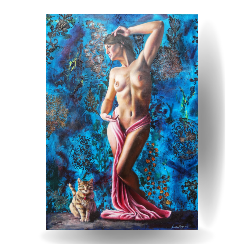
4. Color Harmony vs. Color Chaos
While you can always change colors as you paint, starting with a harmonious palette makes the process smoother.
• Limited Palettes: Look for references that have a dominant color or a clear complementary scheme (like the orange of a sunset against a blue sea).
• Texture and Detail: Ensure the reference has enough "visual information" in the areas you want to emphasize. If the shadows are just "black holes" with no detail, you’ll have to invent what’s inside them.
Add comment
Comments